
Commerce Product Simplification.
In a nutshell.
Challenge
Skype's commerce product offering had become complex, with more and more product SKU’s added over time. Research also showed it was difficult for users to understand.
There was a desire to simplify the structure in order to make the decision making process simpler for users and to improve the product portfolio management.
My role
Led end-to-end design work including hands-on interaction design, team guidance, and research collaboration
Planned and coordinated design efforts across multiple product areas
Facilitated rituals, socialised work, and managed stakeholders
Impact
Improved UX through simplification of the number and structure of Skype's paid offering.
Improved portfolio management, driving efficiencies and cost saving.
Approach.
The team
There was a core team made up of product, engineering and design who worked across the programme of work. Because it was and end-to-end initiative, covering browse, commerce and account management there was lots of co-ordination across a number of teams who contributed and delivered different parts of the solution.
The eco-system
I started work on this project not long after joining Skype so hit the ground running! 🏃♂️There were various insight reports and materials I needed to understand, new colleagues to meet and collaborate with whilst also getting to grips with understanding the product and how the company operated.
To help me understand the Skype product eco-system as well as the commerce touch points, I conducted a mapping exercise to ensure we understood all the areas of the experience which would be impacted by revamping the commerce product offering. This also helped me get up to speed and understand the product ecosystem more broadly.
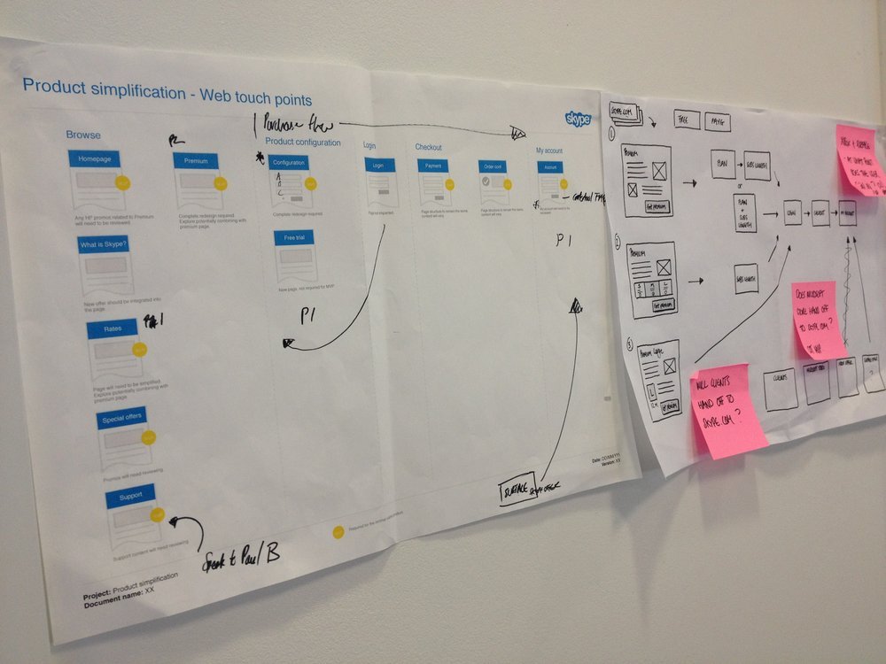
Touch point mapping example
The journeys
We then identified and mapped ideal states for core user journeys covering both new and existing user scenarios.
This helped us understand the connections between different product verticals, how much configuration might be needed at a touch point level and what areas could be consistent and handle different scenarios.
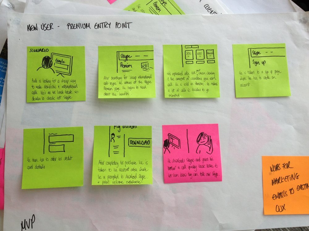
Core user journey example
Product configuration
We explored a range of approaches for structuring the product offering, sketching lo-fi concepts initially. We carried out regularly user research with users throughout the product lifecycle which informed decision making. Design concepts were refined and iterated, the fidelity increasing along the way.
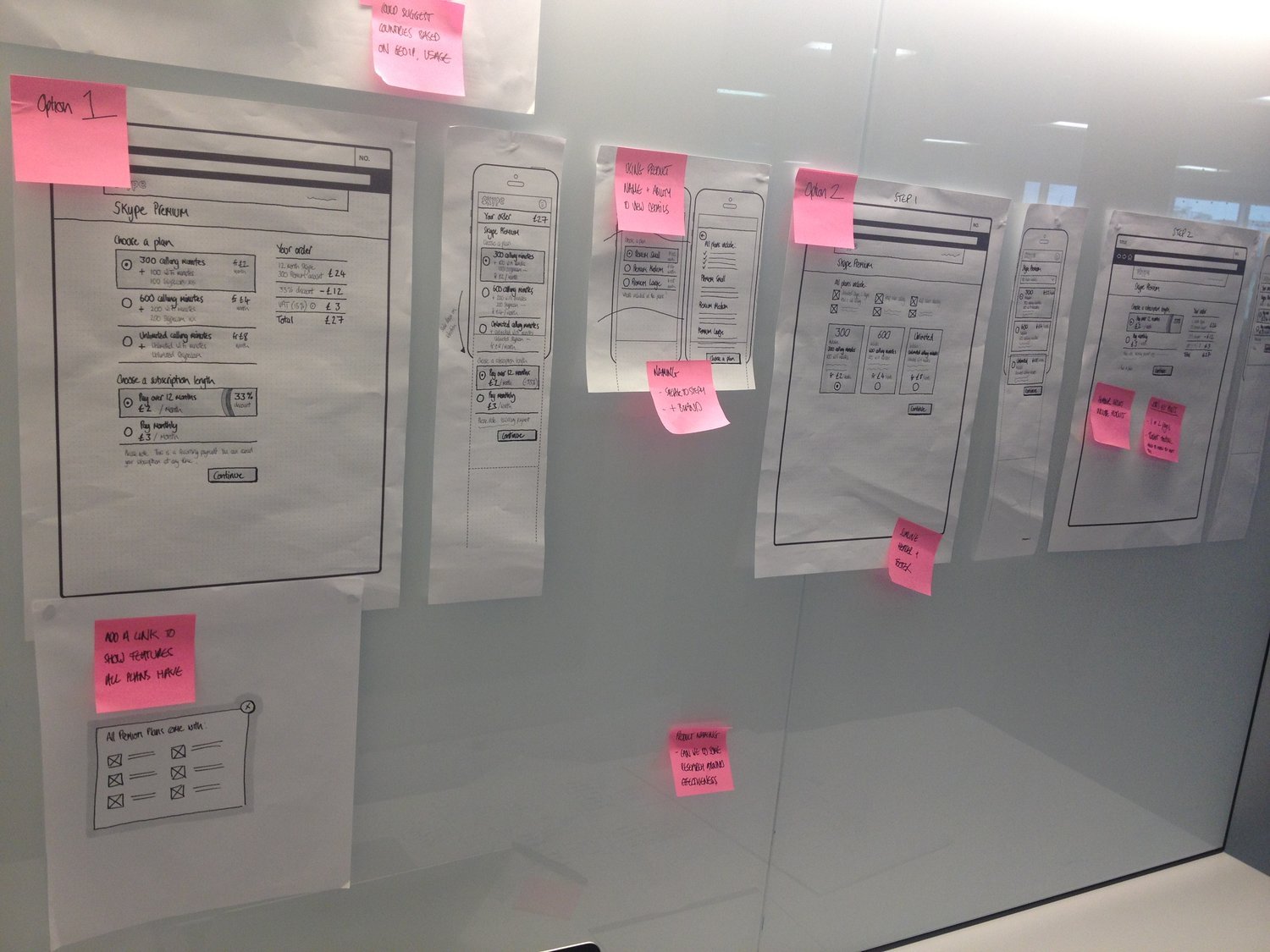
Lo-fi sketches of bundle configurator
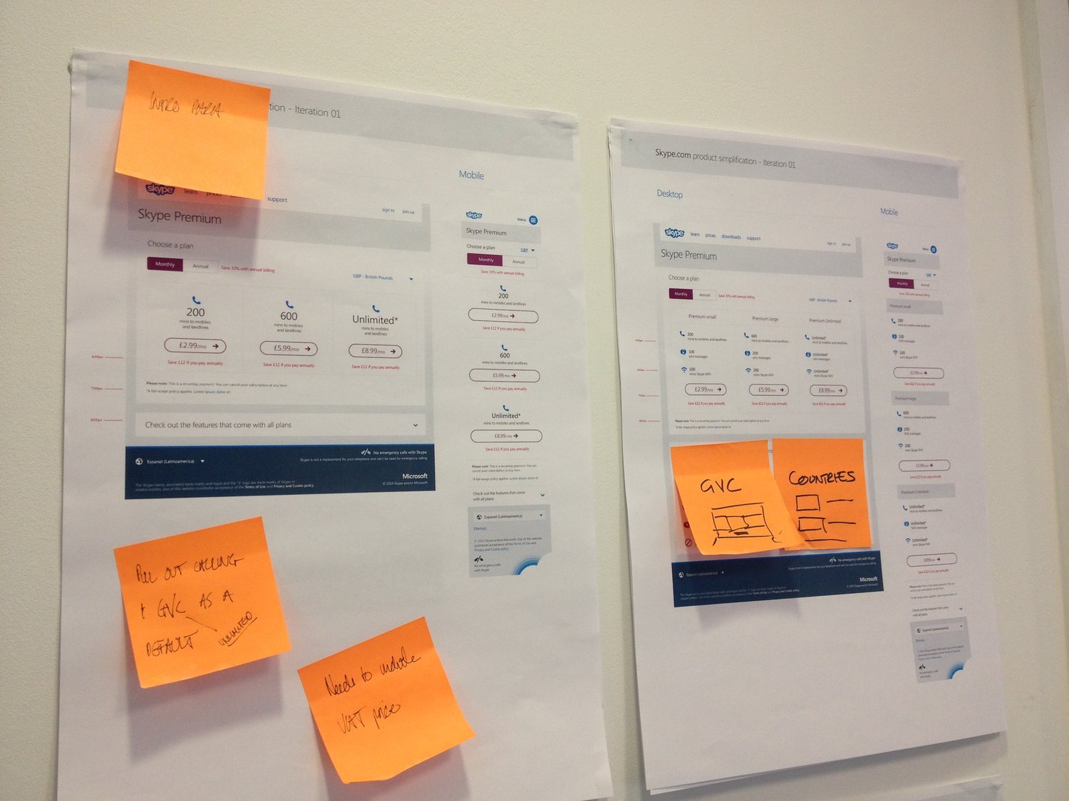
Design & delivery cycles
Hi-fidelity designs were created for all the touch points across the end to end experience covering browse, commerce & account management. Across the programme of work, we collaborated with four core teams to break down the various teams to build, ship and iterate. The solution was rolled out in Australia & Brazil initially, before being rolled out more widely and iterated.
The solution was a small number of competitively priced plans, making it easy to choose the perfect one, as the price only depends on the number of minutes included per month. Then users can call any of the 80+ countries without counting the cost. All plans included group video calling to bring special moments to life.
Design iteration critique

